

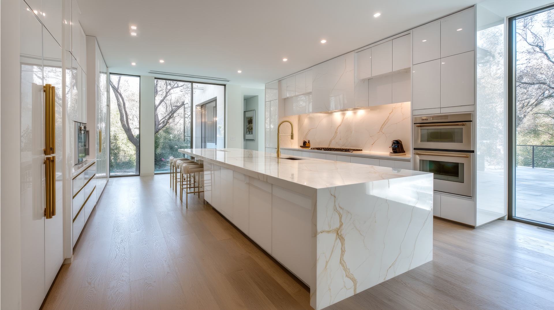
Luxury vinyl plank (LVP) flooring has evolved into one of the most trusted choices for modern homes, not only because of its durability but also because of its ability to mimic hardwood in an incredible range of colors. But choosing the right color palette—especially when deciding between warm and cool tones—can feel overwhelming. Each tone affects mood, lighting, and the overall feel of your space. When the right shade is selected, LVP sets the foundation for a cohesive, comfortable home that reflects personal style.
How warm tones change the energy of a space
Warm-toned LVP features hues like honey, caramel, chestnut, sand, and golden beige. These shades naturally bring a sense of comfort and coziness—something homeowners love when creating inviting rooms.
Warm tones:
Complement rustic, farmhouse, traditional, and Mediterranean design styles
Soften large open areas by adding visual warmth
Pair beautifully with cream, beige, taupe, natural wood, and bronze or gold accents
Make rooms feel more intimate and grounded
If the goal is to create a space that feels comforting—like a welcoming living room, a family-first dining area, or a cozy bedroom—warm LVP tones are a timeless choice.
Where warm tones shine in modern homes
Warm colors work especially well in rooms that need a gentle, lived-in feel. Open-concept homes benefit from warm floors because they help break up large spaces visually. Homes with a lot of natural light also look stunning with warm LVP, as sunlight enhances the golden undertones naturally.
They’re also ideal when the goal is to pair flooring with warm cabinetry such as maple, hickory, cherry, or walnut. If warm trim, warm fabrics, or warm metals exist in the room, choosing a warm-toned LVP keeps everything harmonious.
How cool tones shape brighter, calmer interiors
Cool-toned LVP includes colors like gray, greige, ash, driftwood, weathered oak, and stone-washed beige. These tones bring a sense of calm, cleanliness, and modern sophistication.
Cool tones:
Pair well with Scandinavian, coastal, modern, and minimalist designs
Help rooms feel larger, brighter, and more open
Complement white, charcoal, black, blue, and cool-toned neutral décor
Work beautifully with cool metals like brushed nickel, chrome, and stainless steel
If the goal is a sleek, airy aesthetic—or if the home features a lot of cool décor—cool-toned LVP provides a fresh, elegant canvas.
Rooms where cool tones make an impact
Cool colors are popular choices for bathrooms, kitchens, and contemporary living spaces. If a room doesn’t receive enough natural light, cool tones help brighten the space visually without overwhelming the design.
Greige remains a trending favorite because it blends the best of both worlds—balancing warmth and coolness for flexible styling. This makes it a go-to for homeowners who want a modern look without committing too heavily to cold or warm shades.
Balancing tone and lighting for a more cohesive home
Lighting plays a powerful role in how warm and cool LVP tones appear. Natural light brings out true undertones, while artificial lighting—especially LED, fluorescent, or warm incandescent light—can shift the appearance of flooring dramatically.
Tips for using lighting to guide tone selection:
South-facing rooms tend to enhance warm hues
North-facing rooms often make cool tones look cleaner and brighter
Warm light bulbs complement warm floors and neutralize cool tones
Cool-toned lighting makes warm floors look richer and gives gray floors more depth
Always view flooring samples at different times of day to see how the tones shift with lighting changes.
Finding the right tone for your home’s style personality
Understanding the home’s style helps narrow down the perfect LVP shade.
For homes embracing a rustic, farmhouse, or vintage look:
Warm browns, golden beiges, and caramel tones reinforce the inviting, lived-in feel these styles are known for.
For modern minimalist or Scandinavian-inspired spaces:
Soft grays, whitewashed tones, and cool driftwood shades create an airy, peaceful atmosphere.
For transitional or flexible décor:
Greige and neutral beige-gray tones offer a balanced look that works with nearly any future design change.
For bold, dramatic interiors:
Dark cool colors like charcoal gray or espresso brown add depth and visual interest without overwhelming the room.
How to test warm and cool tones before making your final decision
LVP flooring is best evaluated in real-life conditions. Simple steps can help build confidence when choosing the perfect tone.
Do this when comparing shades:
Place samples next to furniture, wall colors, and cabinetry
Check samples in morning, afternoon, and evening lighting
Lay two to three planks side by side to see pattern variation
Photograph samples to catch undertones that the eye may miss
Consider the long-term—styles, furniture, and preferences may evolve
The right choice will feel balanced, natural, and in harmony with the rest of the space.
How warm and cool tones can coexist beautifully
A home doesn’t need to commit exclusively to warm or cool tones. Today’s design trends embrace blending both for a layered, modern look. For example, cool-toned floors paired with warm wood furniture create richness. Warm floors with cool walls can add contrast and freshness.
The key is maintaining balance: choose one tone family for flooring and let other elements complement or contrast subtly.
Explore a beautiful LVP palette with Springfield’s trusted flooring experts
For more than 50 years, our team at The Carpet Shoppe has helped homeowners across Springfield, Ozark, Nixa, Branson, and Republic discover flooring that matches their style, budget, and long-term vision. Visit our showroom or contact our flooring experts today—we’d love to guide you to the perfect warm or cool LVP palette for your home.

